First Lesson: with Julie, we came up with idea and taglines, typing potential taglines into InDesign and testing fonts. We also considered how to avoid reflections. My first idea was very simple, but it gradually got more interesting towards flying cutlery.
Second Lesson: in Tom's lesson my idea evolved again to dancing of walking cutlery. We then took test shoots in the studio; through testing I discovered that walking cutlery (such as on a cat walk) would be easier than dancing cutlery
Third Lesson: in Matts lesson we had a crit of each others work and edited images from the lesson before.
Crit:
Is the image fit for purpose: Yes
How could the images be used (what products could they advertise): Cutlery, Video/Stop Frame/Poser
What good practice can you see in the image: Layout, Logo/writing placement, Idea - different, interesting, makes you look and remember - Lighting - cutlery looks shiny.
How could the image be improved: Use rulers when placing/lining up images, possibly move logo to other side of text, swap top corner image, decide shadows or no shadows
Any other constructive comments: try to avoid reflections in cutlery
Fourth Lesson: in Tom's lesson we took our final photo's and edited to the final image.
Fifth Lesson: with Mike we finished off everything and started writing up work
Showing posts with label advertising. Show all posts
Showing posts with label advertising. Show all posts
Tuesday, 30 April 2013
Thursday, 18 April 2013
Evaluation - Paper Clips
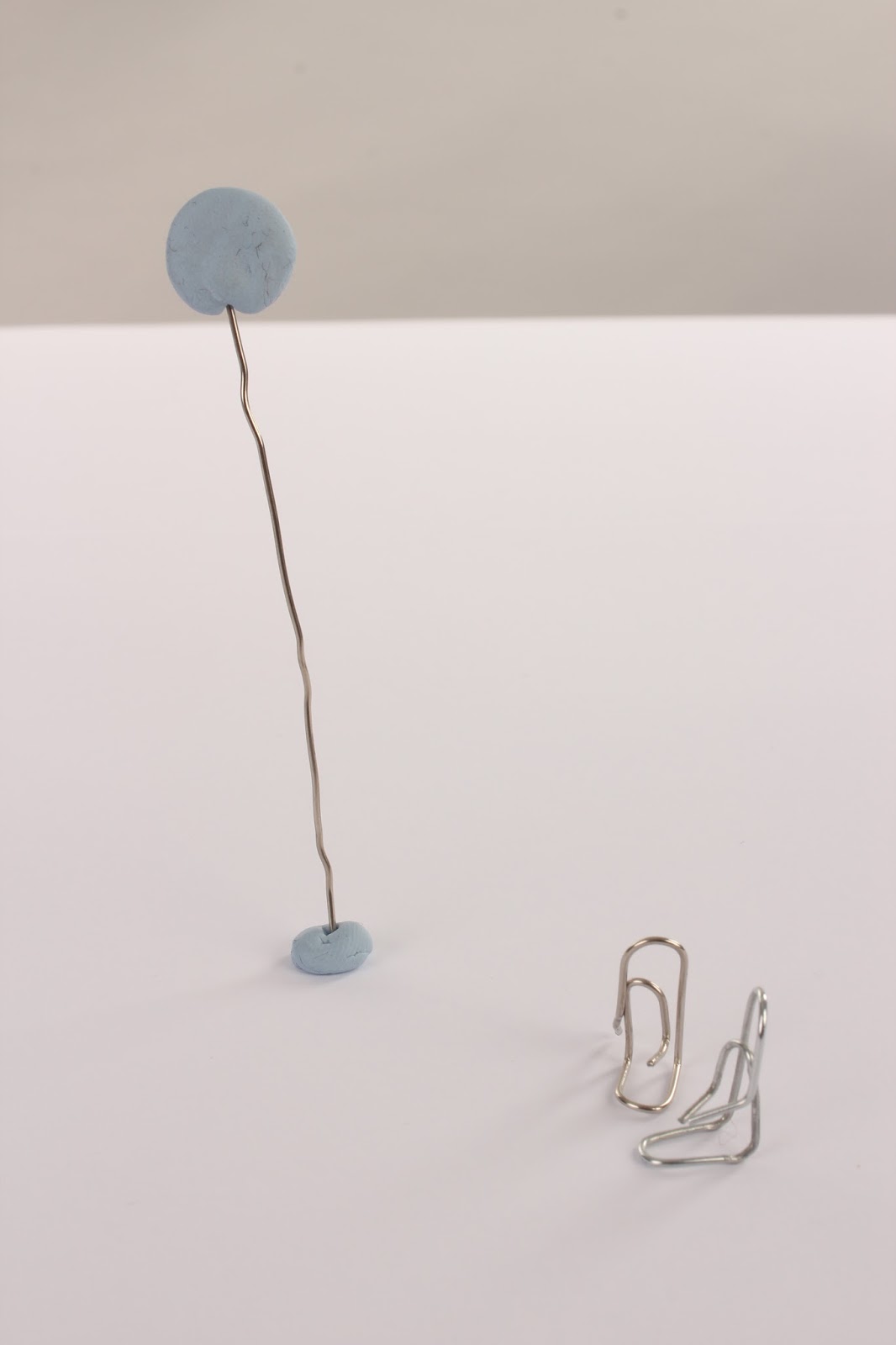
For this project, we had a choice of: bin liners, paper clips, takeaway boxes, plastic cups, plain black or white socks and dish cloths to advertise. I chose paper clips, I liked the idea of trying to make paper clips fun - and after a little research, I decided to make figures out of them. Initially, I tried to bend them using just my fingers, but it was very difficult, and painful, so I used pliers instead.
The first photographs I took were on a plain white background, which was very dull and did not convey the idea of paper clips being in any way fun for bored people.
For the second shoot, I had a computer keyboard and mouse in the background - the images were much more interesting with these included, however the keyboard was very dirty, and I spent a lot of time on Photoshop 'cleaning' it up. I could have solved this problem before shooting by using a different keyboard, if I had noticed. I should have taken some more photographs, using a cleaner keyboard, once I had noticed, but wasn't sure I had the time - although I now realise that I would have done. I would also like to add the other paper clip scenes - the engagement and the wedding, for example - but in the photographs I took with them, all the dirt in the keyboard and mouse were very visable.
I like the tag-line that I have used, 'Bored? Paper Clip!', and that the pictures now look office-y - they work together to provide an interesting, but simple image, that grabs your attention and draws your eyes to the paper clip. I do feel, however, that the images would probably work best in a magazine, rather than on a billboard or poster - but I have an edited image for all 3 mediums; I think I should have made a TV/film advert, showing the paper clips being bent.
Tuesday, 26 March 2013
lighting set ups
First Shoot

 |
Red: table
Black: camera
Peach: lights
Yellow: using Umbrella, not soft box
Line at far end: background
Final Shoot

Grey Circle: clips
Grey Boxes: Keyboard and mouse
Red: table
Black: camera
Yellow: lights
Pack Shot

Red: table
Black: camera
Yellow: lights
Edits - 1st and 2nd

First Attempts

These pictures seem forced - unnatural and badly thought through. The bold, colourful text doesn't suit them and the story (on the left) is difficult to understand - they make friends (taking under the moon/sun) they get engaged, they get married. Also, the groom is upside down in the wedding.
Second Attempts - much better, final pieces?


I prefer these ones - they look more sophisticated and give the clips context with the keyboard and mouse in the background. However, I don't like the 'Bored' one on the bottom left - the angle and lighting combined to make the picture look dull and rather lifeless. I like the contrast in the portrait picture (poster), I got this effect from 'Colour Lookup', a layer add-on in Photoshop CS6.
Saturday, 23 March 2013
Proposal - Paper Clips
For this project I would like to look at creating people out of paper clips. I like the idea of creating scenes with them - such as a trip to the park or some at their desk. In order to create these people, I need to bend them - ideally using pliers - and make some sort of scenery for them. I'm not sure whether to have the clips standing - using blu tack - or flat on the table. Standing would give the paper clips more life; I shall have to experiment with it.
I would like to make poster, billboard and magazine adverts.
The main objective of the campaign would be to weaken the boring, work only connotations of paper clips being to clip paper, and show the wider world that you can actually have fun with them - and not just completely straightening the clips out so you have a bit of wire. The campaign would make paper clips useful/interesting to a wider audience and increase sales.
Friday, 15 March 2013
Research - General
T-Mobile -
http://www.slideshare.net/UnrulyUK/mobile-t-mobilelifes-for-sharing
Crabbies Ginger Beer - George and Camilla
"Halewood International, the UK’s leading independent drinks manufacturer and distributor has announced its biggest ever TV campaign for Crabbie’s Alcoholic Ginger Beer to kick start a wave of high profile activity over the summer.
http://www.crabbiesgingerbeer.co.uk/tv-ads/
http://www.ponderosagroup.co.uk/work/crabbies-alcoholic-ginger-beer/
http://www.slideshare.net/UnrulyUK/mobile-t-mobilelifes-for-sharing
Crabbies Ginger Beer - George and Camilla
"Halewood International, the UK’s leading independent drinks manufacturer and distributor has announced its biggest ever TV campaign for Crabbie’s Alcoholic Ginger Beer to kick start a wave of high profile activity over the summer.
"Crabbie’s will hit TV screens with a brand new creative concept featuring the brands renowned retro duo, George and Camilla in a spiffingly English picnic scene, and will run for six weeks from 11 July to 22 August – the brands longest running appearance on TV to date.
"Running a national network campaign with 20 second adverts, the TV campaign will have a massive impact across the UK adult population. It will provide a constant stream of air time over the key summer period to drive awareness and sales in both the On and Off Trade.
"As part of the summer schedule of activity, Crabbie’s will be attending twelve picnic in the park music events organised by Stonegate Picnics across the country providing an opportunity for sampling and sales as well as offering VIP picnic packages.
"Crabbie’s marketing controller, Al Cross, said: “With a full summer of activity planned to support the broadcast, we are really urging customers to stock up for summer to avoid missing out on the continued fast paced growth and demand for Crabbie’s Alcoholic Ginger Beer.
"“The new creative follows the usual essence of the Crabbie’s brand and will add to the all year round refreshing taste of Crabbie’s. This is one part of our large scale activities, capturing summer drinkers but due to the versatility of Crabbie’s we continue to enjoy fantastic sales throughout the year.”"
http://www.talkingretail.com/products/product-news/crabbies-alcoholic-ginger-beer-back-for-summer-tv-adverthttp://www.crabbiesgingerbeer.co.uk/tv-ads/
http://www.ponderosagroup.co.uk/work/crabbies-alcoholic-ginger-beer/
Monday, 11 March 2013
paper clips research
http://www.officemuseum.com/paper_clips.htm


http://www.nbcnews.com/id/12353171/#.US8sqmhYWJU

http://smilepanic.com/fun-with-paper-clips/

http://www.funology.com/paper-clips-in-love/

http://www.accountancyage.com/aa/feature/2153953/-aayp-generation-ys-expectations

http://lifehacker.com/5152309/diy-heart+shaped-paperclips

http://www.cartoonstock.com/directory/c/clip.asp

http://www.cartoonstock.com/directory/c/clip.asp


http://www.nbcnews.com/id/12353171/#.US8sqmhYWJU

http://smilepanic.com/fun-with-paper-clips/

http://www.funology.com/paper-clips-in-love/

http://www.accountancyage.com/aa/feature/2153953/-aayp-generation-ys-expectations

http://lifehacker.com/5152309/diy-heart+shaped-paperclips
http://www.cartoonstock.com/directory/c/clip.asp

http://www.cartoonstock.com/directory/c/clip.asp

Friday, 8 March 2013


Friday, 22 February 2013
Evaluation - Biscuits
I think that the whole think worked our quite well. The finished poster is missing the Mcvities logo (I'll add it on after half-term). I lightened the image and cropped it in photoshop so that it was a little more cheerful, easy to see and fitted exactly how I wanted it to on the page. Taking the photos not difficult - I used a table from a classroom, with a white table cloth over it and documented a my models pretending to play poker. I think it went a lot better than the cutlery assignment from the week before.


 |
| THESE ARE NOT REAL ADVERTS |

Lighting Layout - Biscuits
Yellow shape: Lights, Red box: Table, Brown circle: Biscuit/s, Black circle: Camera, Grey/Blue ovals: Models

Pack Shot of biscuit (taken from above)

Pack Shot of biscuit (taken from above)

Playing Poker
Proposal - Biscuits
In order to advertise McVities Digestives to a new audience, I shall use a gambling theme. Poker being especially simple - and easy for work restricted to the studio, will be the game I focus on. For the poster I will have 2 people playing poker, side on - camera level with the biscuits - and only the players hands visible - removing any personal element. I will have a sort of halo around the biscuits from a light shining on the background - other than that one very bright light, the lighting will be even.
Timeline - Biscuits
First Lesson: with Julie, we came up with idea and taglines, typing potential taglines into InDesign and testing fonts. My first ideas were very simple, but it gradually got more interesting so that people were playing cards with biscuits

Second Lesson: in Tom's lesson we then took test shoots in the studio; I found I needed a fairly large table and a bigger back drop to avoid getting the walls in the images.
Third Lesson: in Matts lesson we edited images from the lesson before
Fourth Lesson: in Tom's lesson we took our final photo's and edited to the final image.
Fifth Lesson: with Mike we finished off everything and started writing up work
Cutlery Adverts


These are just adverts picked up from the internet, but they show 2 distinctive styles towards the products. There are the simple, laid out images and the mixed together - probably though editing - perfected images.
Proposal - Cutlery
I would like to sell the cutlery by making them look like they are dancing or walking. Initially, I started by looking at traditional cutlery photographs, which evolved into cutlery attacking people to dancing cutlery, which may be hard to replicate in the studio.
I would like to have a sort of stage like set up for the cutlery, like a catwalk or theatre. If I can't make a stage then the image will look like a bit like a stop-motion animation, or comic strip. I have decided to use digital media for this project as I need an image thats easy to manipulate.
I would like to have a sort of stage like set up for the cutlery, like a catwalk or theatre. If I can't make a stage then the image will look like a bit like a stop-motion animation, or comic strip. I have decided to use digital media for this project as I need an image thats easy to manipulate.
Evaluation - Cutlery
Deciding to use digital media was a very good idea - as the planned images would have taken far too long to have put together otherwise. Unfortunately I was unable to make an image with a stage due to time restraints, but I was able to create the catwalk comic strip.
All the images needed editing as the hands of people holding the cutlery were in the images and they were too wide.
I'm please with the out come, although some of the editing could be better and my reflection is in the spoons - I didn't know how to edit them out, I think for a first attempt, I've done pretty well. It looks good. However, it would be nice not to work with reflective things next week


Subscribe to:
Posts (Atom)