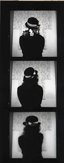
Shoot 1:
The first shoot did not go well. To start with I forgot to roll on the film, then, when I removed the film after the shoot found that the film was either loaded the wrong way round (particularly problematic with paper backed film) or somehow got twisted in the camera (I tried to roll the film on a new spool so that I could use it again, only to find, when I got to the tape, that the film and paper were looping around the spool)
Shoot 2:
Went much better. Used 2 rolls of film - both turned out fine, no digital camera involved at all. There weren't as many props this time but every single image I took was captured and very few were blurry - only 3 came out badly and I think that was from the developer not reaching them in the tub (so me not shaking it enough)
Dark Room: all gone fairly smoothly, apart from aforementioned issues that were mostly my fault, the only problem was having to re-do a photo due to having wet fingers while using exposing the paper, so rubbing the emulsion off
Showing posts with label Matt Smith. Show all posts
Showing posts with label Matt Smith. Show all posts
Thursday, 31 January 2013
Evaluation: Portraits
For this project we have looked at several different photo formats, from large format film, to digital.
I have made series of photographs based mainly on Cecil Beaton, using a medium format camera and film, as opposed to a large format camera. I have also taken colour digital photographs to go with the black-and-white film pictures and back them up. I think this project has gone really well, especially since I had to take the photos, develop and edit them in two weeks. The images themselves have turned out better than I expected. The first shoot I did I lost most of the images, but the second one was much better, and I didn't loose a single one. Overall, there is only about 3 photos not in focus, including on the film that got caught in the first photo session.
I'm happy with how the images have turned out - even though they don't all work together, they are all pretty good images in themselves. Of the 3 film images I've chosen to use, all are very different, but very similar. They are the same size and shape and hats and flowers feature prominently. Although I didn't mention flowers in my initial proposal, it seemed natural for me to include hair-pieces generally.
I did struggle a bit with the dark room - I don't think I developed of the negatives correctly, part of one is mostly black but still usable. The grey-scale varies between the pictures, and image that went wrong the first time I developed it, is much darker on re-doing due to (I think) using fresh chemicals or leaving in the developer for the correct time.
Friday, 25 January 2013
Proposal
The concept of my portraiture based around Cecil Beaton and the very posed, still looking images that he and his contemporaries took. In particular I would like to look at hats as a fashion piece/statement. I will concentrate on head shots and close-ups.
The photo's will be taken in the studio, using a mix of both medium format film and digital formats. I'd like to use a combination of soft light and harsh to produce shadows. For that I will need three lights, with two soft boxes and a cone, I may also open the blinds so as to have as much light as possible, while still creating shadows. The models hair will be styled half up/half down
My influences for this project were Cecil Beaton and Horst P. Horst. To a lesser extent famous poses - such as Hamlet with a skull - have also influenced me, Rankin may also have an effect.
I will be producing 5+ images in a mix of colour - digital - and black-and-white - film. All the photos will be studio portraits with similar lighting, hair and clothing.
Tuesday, 11 December 2012
Cecil Beaton
Cecil Beaton was THE fashion photographer of the 1930's, 40's and 50's, and sill working with famous clientele during the 1960's. His carrier stated during the mid 1920's after finishing at Cambridge University, albeit without a degree, as a society photographer. His style and creativity lead him to photograph the British royal family, Marylin Monroe, and for Vogue - as well as designing the sets and costumes for My Fair Lady - both the original play and the 1965 film starring Audrey Hepburn.
In this photograph the dress has been made the greatest feature - the woman wearing it comes second fiddle; she's hidden completely by the hat and the light, she's in shadow. The dress had been carefully picked out buy the lights and movement. As the model has picked up her skirt, it has caught the light and every single pleat is visible.
The background seems to be a print on fabric or thin paper, it makes the photo seem more feminine and serene than without. The daffodils, although fake, are the same. Making the young woman come across as calm.
These photographs almost certainly use back projection. There are very few - and not as easy - ways to create this effect. I like the almost jokey postures of the men on the left-hand photo. They take away the dull, serious feel that would be there if it was just the woman in the picture. The second picture, with a woman striking an almost identical pose, looks more elegant, due to the ribbon and lace surrounding her, and making her, not just the feature, but also a little angelic.
http://loveisspeed.blogspot.co.uk/2012/02/life-with-high-society-photographs.html
http://kritinaknief.blogspot.co.uk/2012/03/cecil-beaton.html
Wednesday, 5 December 2012
Documentary Evaluation
The project was confusing, I have never been very good at planned documentary photography, like this project. However I did enjoy the process of taking the pictures, walking around town. I also enjoyed editing them - I learnt new techniques and finally found out what 'dodge' and 'burn' tools do.
Sadly I had a very bad cold half way through which affected how many photos I took.
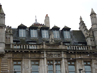
I think it comminicated '1 square mile' quite well - although I don't think I managed to cover a whole mile, unless you live in Leeds you would not be able to tell this - the statues are all in different places, all look different and have a slightly different reason behind them.
If I did this again, I would make sure I got more pictures, going around different parts of the city - such as the arcades - so that there could be more variety in the pictures. I would also try to take photos against different backgrounds - all of the statues are either in or against sandstone.
I have learnt more editing techniques, tool uses (dodge and burn) and styles during this project; as well as I find it imossible to come up with documentary ideas on my own (I spent the first week with no direction for my project).
Conceptually, once I finally found some direction, I found the project fairly easy. There is much in the way of art in Leeds, and the most noticable, yet most ignored, are the carvings and castings on and around the older buildings. Think I have improved my ability to communication with my pictures for this project
Tuesday, 4 December 2012
Docomentary Proposal
For this project we have been looking at different types and styles of documentary photography, including architectural photography - which was the style I most liked using: no talking to strangers and no stalking. Because I enjoyed this style much more, it is the style I will be using to take my final images.
I would like to photograph art works around Leeds. Art is often ignored is it’s not bright or in your face. The city center is full of hidden, unnoticed works - especially on and around Victorian buildings, which will be something I focus heavily on. There are quite a few figures on buildings, and I plan to use them to form the bulk of my work. I would like to show that the figures/art are constantly ignored by the busy inner city workers, and hopefully find some things I didn’t know about before.
Looking at Eugene Atget, I quite like the idea of documenting for future reference and for the sake of documenting, to help protect the buildings/art for the future. His photographs give a profound sense of what was there, this is something I'd like to try to copy by showing both the building/s and the area.
Given that Atgets’ images were all black-and-white, although not through choice, I would like to edit the photos I take to a similar intensity of grey; that look like a reasonably realistic black-and-white edit. I will do this in Photoshop using the black-and-white layer, and then the burn and dodge tools to create a more 3D looking picture, emphasising the light and shadow of the pictures.
I shall try to involve some sort of context by including people, cars, buses etc. in the images, to make it discernible that they have been taken in a busy city. However, while keeping the parts of the environment in the pictures, I would like to be sensitive to towards the age of and effort involved in much of the work.
The skills for these sculptures have, not so much been lost, but neglected, so almost all the sculptures are old. These sculptures and facades are often all that’s left of many a Victorian building where much, if not all, the inner moulding have been ripped out and modernised and the floors ripped out and doubled.
I already have a rough idea of how I might layout my photo's, I will have a pillars or similar at the bottom, drawing the eye to any landscape images I use. This will be similar to the layout I used for Dervyn's studio assignment last year, albeit without the jokey twist.
I already have a rough idea of how I might layout my photo's, I will have a pillars or similar at the bottom, drawing the eye to any landscape images I use. This will be similar to the layout I used for Dervyn's studio assignment last year, albeit without the jokey twist.
Review
Test Shots
There are some good photo's here, but for the most part they are rather dull. During Tom's lesson, general opinion seems to be look at ignored/hidden works more
Proper Shoot
Mostly awful, some good ones. Need editing. Been looking at Eugene Atget for Mike's lesson; quite like his style, tried to coppy it a little, don't think it really worked. Will probably choose images with people in for the most part
Edits/Final Images
Pretty happy with these, although would liked to have taken some more on the other side of town for more variety, sadly had nasty cold.
There are some good photo's here, but for the most part they are rather dull. During Tom's lesson, general opinion seems to be look at ignored/hidden works more
Proper Shoot
Mostly awful, some good ones. Need editing. Been looking at Eugene Atget for Mike's lesson; quite like his style, tried to coppy it a little, don't think it really worked. Will probably choose images with people in for the most part
Edits/Final Images
before edit!
Pretty happy with these, although would liked to have taken some more on the other side of town for more variety, sadly had nasty cold.
Subscribe to:
Posts (Atom)


